


In my previous articles, I talked about What is Html? and Some Html tags (Here is the link to that article). Now we will see the Input tag and its attributes used to make an online form where users can fill in their necessary information. At the end of this article, you can find links to code files and the website.
Brief introduction of the input element
To take data from a user, the <input> Html element is used within the <form> element to define input controls so that the user can interact with the web-based form. It's a self-closing tag that has various attributes with a variety of type attributes such as text boxes, checkboxes, radio buttons, and more.
<input> type Attribute:
This type attribute is used to specify the type of the input element. Its default value is text.
Let's see how these <input type=""> elements work in Html one by one:
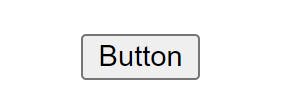
button:
It is used to define a clickable Button in a document. It is mostly used with JavaScript to activate the script.
<form>
    <input type="button" value="Button">
</form>
Output:
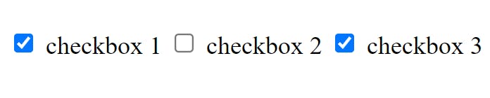
checkbox:
The checkbox selects one or more options among the given choices. The checkbox appears as a square box that is ticked when it is activated.
<form>
    <label>
        <input type="checkbox"> checkbox 1</label>
    <label>
        <input type="checkbox"> checkbox 2
    </label>
    <input type="checkbox" id="3rd" name="horns">
    <label for="3rd">checkbox 3</label>
</form>
Output:
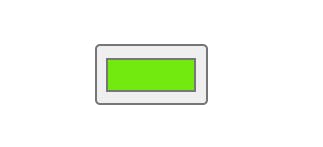
color:
It displays a colour picker where the user can pick any shade of colour.
<form>
    <input type="color" value="#4EE916">
</form>
Output:
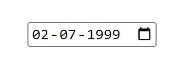
date:
This control gives the user the liberty to choose a date. The value will be the year, month, and day.
<form>
    <input type="date">
</form>
Output:
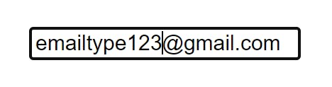
email:
It is used to define a field for the email address. If the user inputs the email id then it will automatically check the format of the email id whether it is correct or not.
<form>
    <input type="email">
</form>
Output:
file:
It is used to upload files from the user side.
<form>
    <input type="file" accept="image/png, image/jpeg">
</form>
The accept attribute is optional and is used to specify the types of files that can be uploaded through the file input field. In this case, the accept attribute restricts the file types to only PNG and JPEG images, and any other file type will be ignored.
Output:
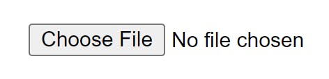
image:
It is used to define an image as the submit button. It displays an image defined by the <src> attribute. The <alt> attribute displays text if the image is missing.
<form>
    <input type="image" alt="Login" src="/media/examples/login-button.png">
</form>
Output:

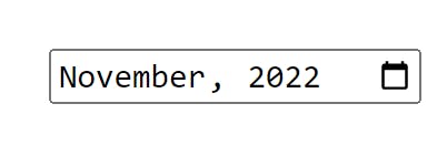
month:
It is used to specify the control of the month and year fields. The value must be in the format of “YYYY-MM”.
<form>
    <input type="month">
</form>
Output:
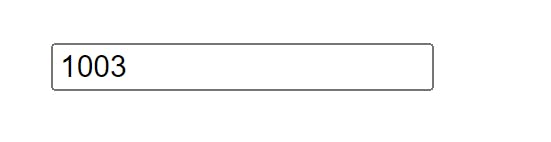
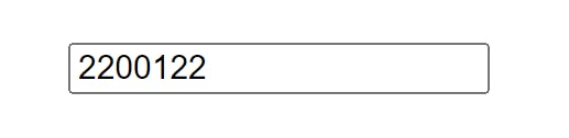
number:
It is used to specify an input field for entering a number.
<form>
    <input type="number">
</form>
Output:
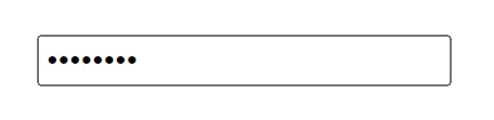
password:
It is a one-line plain text editor control in which the text is concealed so that it cannot be read, it replaces each character with a symbol such as an asterisk ("*") or a dot ("•").
<form>
    <input type="password">
</form>
Output:
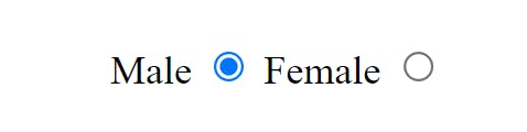
radio:
Buttons are used to let the user select exactly one option from a list of predefined groups. You can have as many radio groups on a page as you like, as long as each has its unique name.
<form>
    Male <input type="radio" name="gender" id="male" required>
    Female <input type="radio" name="gender" id="female" required>
</form>
Output:
range:
This input type is represented using a slider control rather than text when the precise value is not considered important.
<form>
    <input type="range">
</form>
Output:

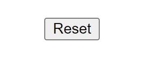
reset:
It is a button used to reset all the form values to their initial values.
<form>
    <input type="reset">
</form>
Output:
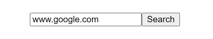
search:
It is used to define a text field designed for the user to enter search queries.
<form>
    <input type="search">
    <button>Search</button>
</form>
Output:
submit:
It is the button used to submit all the user's input data.
<form>
    <input type="submit">
</form>
Output:

tel:
It is used to enter a user's telephone Number.
<form>
    <input type="tel">
</form>
Output:
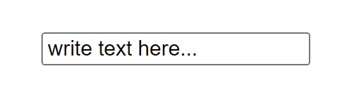
text:
The default value. A single-line text field is used to enter text.
<form>
    <input type="text">
</form>
Output:
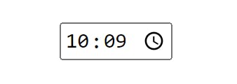
time:
A control for entering a time value with no time zone.
<form>
    <input type="time">
</form>
Output:
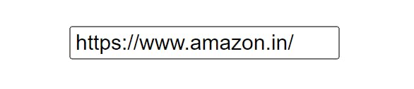
url:
It is used to define a field that entered a URL. This input value is automatically validated before submitting the form.
<form>
    <input type="url">
</form>
Output:
week:
It is used to define a week and a year control field.
<form>
    <input type="week">
</form>
Output:

let's take a look at some other attributes of the input element.
<input> Attributes:
value: It is used to specify the value of the input element.placeholder: It is used to specify a hint that describes the expected value of an input field.name: It is used to define the name of the input element.alt: The alt attribute is used to provide alternate text for the user if they cannot view the image.autofocus: This attribute is used to focus the element automatically when the page loads.checked: Specify that an element should be pre-selected when the page loads. It can be used with a checkbox and radio input type.disabled: This attribute disabled the element until some other condition has been met.form: The form attribute is used to specify one or more forms to which the input element belongs.max: The max attribute is used to specify the maximum value for an input element.required: Specifies that an input field must be filled before submitting the form.readonly: It indicates that the user should not be able to edit the value of the input.accept: It is used to specify the types of files the server accepts.align: This property is used to specify the alignment of an image input.autocomplete: This attribute ensures whether an input element has to autocomplete enabled.dirname: It specifies that the Text direction of the input field will be submitted.formaction: It specifies the URL to use for form submission.formenctype: This property is used to specify how the form data should be encoded when submitting it to the server.formmethod: Defines the HTTP method for sending data to the action URL.formnovalidate: This property is used to define those form elements that should not be validated when submitted.formtarget: It is used to specify where to show the response that is received after submitting the form.height: Define the height (only for type=” image”) of the input element.list: This attribute is used to refer to a data list element that contains pre-defined options for an input element.maxlength: This property is used to specify the maximum number of characters allowed in an input element.min: Specifies a minimum value for an input element.multiple: It is used to specify that a user can enter more than one value in an input element.pattern: It is used to check whether the value of the input element is valid or not.size: Define the width (in characters) of the input element.src: This property is used to specify the URL of the image to use as a submit button (only for type=” image").step: This property is used to specify the legal number intervals for an input field.width: Define the width (only for type=” image”) of an input element.
Conclusion:
The <input> element is a crucial part of creating interactive forms in HTML. It allows users to input data and submit it to a web server. The element can be used with various attributes to create different types of input fields, such as text boxes, checkboxes, and radio buttons.
Some of the commonly used attributes include type, name, value, placeholder, required, and disabled. These attributes help to specify the type of input field, set initial values, provide hints, and enforce input requirements.
By understanding the different attributes of the <input> element and how to use them, developers can create intuitive and user-friendly forms that allow for the collection of accurate and relevant data from website visitors.
Here are some links related to this article
Code files GitHub
Link to the website. ( Input Type Attributes )
Thanks for reading! I hope this article was helpful to you😇😇😇